Premium Design

Premium Design

  • Premium design for WordPress websites encompasses a range of themes and templates that offer enhanced features, professional aesthetics, and customizable options to create stunning and functional websites. Here’s a simple description:
  • Premium design for WordPress websites elevates your online presence with top-notch themes and templates that blend aesthetics with functionality. These premium offerings provide a myriad of benefits, making them a preferred choice for individuals, businesses, and creatives alike.
  • First and foremost, premium WordPress themes boast professional aesthetics that capture attention and leave a lasting impression. From sleek minimalist designs to bold and vibrant layouts, premium themes offer a diverse range of styles to suit various niches and industries. These designs are meticulously crafted with attention to detail, ensuring a polished and visually appealing appearance for your website.
  • Beyond aesthetics, premium themes come packed with advanced features and customization options that empower users to create unique and tailored websites. Whether you’re a beginner or a seasoned developer, premium themes offer intuitive interfaces and user-friendly tools for effortless customization. From drag-and-drop page builders to extensive theme options panels, these features enable you to fine-tune every aspect of your website to align with your brand identity and objectives.
  • Premium themes also prioritize performance and functionality, ensuring that your website not only looks good but also performs optimally across devices and platforms. With responsive design, cross-browser compatibility, and fast loading times, premium themes deliver a seamless user experience that keeps visitors engaged and coming back for more.
  • Furthermore, premium themes often come with dedicated support and regular updates, providing peace of mind and ongoing assistance as you build and manage your website. This level of support ensures that any issues or questions you encounter along the way are promptly addressed, allowing you to focus on what matters most – creating exceptional content and growing your online presence.
  • In essence, premium design for WordPress websites offers a comprehensive solution for building professional, visually stunning, and high-performing websites that stand out in the digital landscape. With their advanced features, customization options, and support infrastructure, premium themes empower users to bring their creative visions to life and achieve their online goals with confidence.
Mobile Responsive

Mobile Responsive

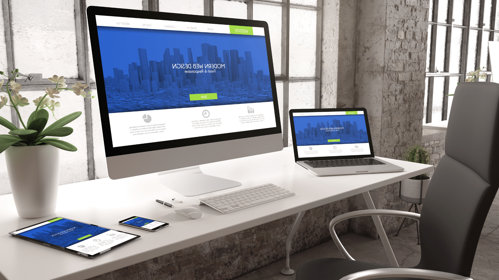
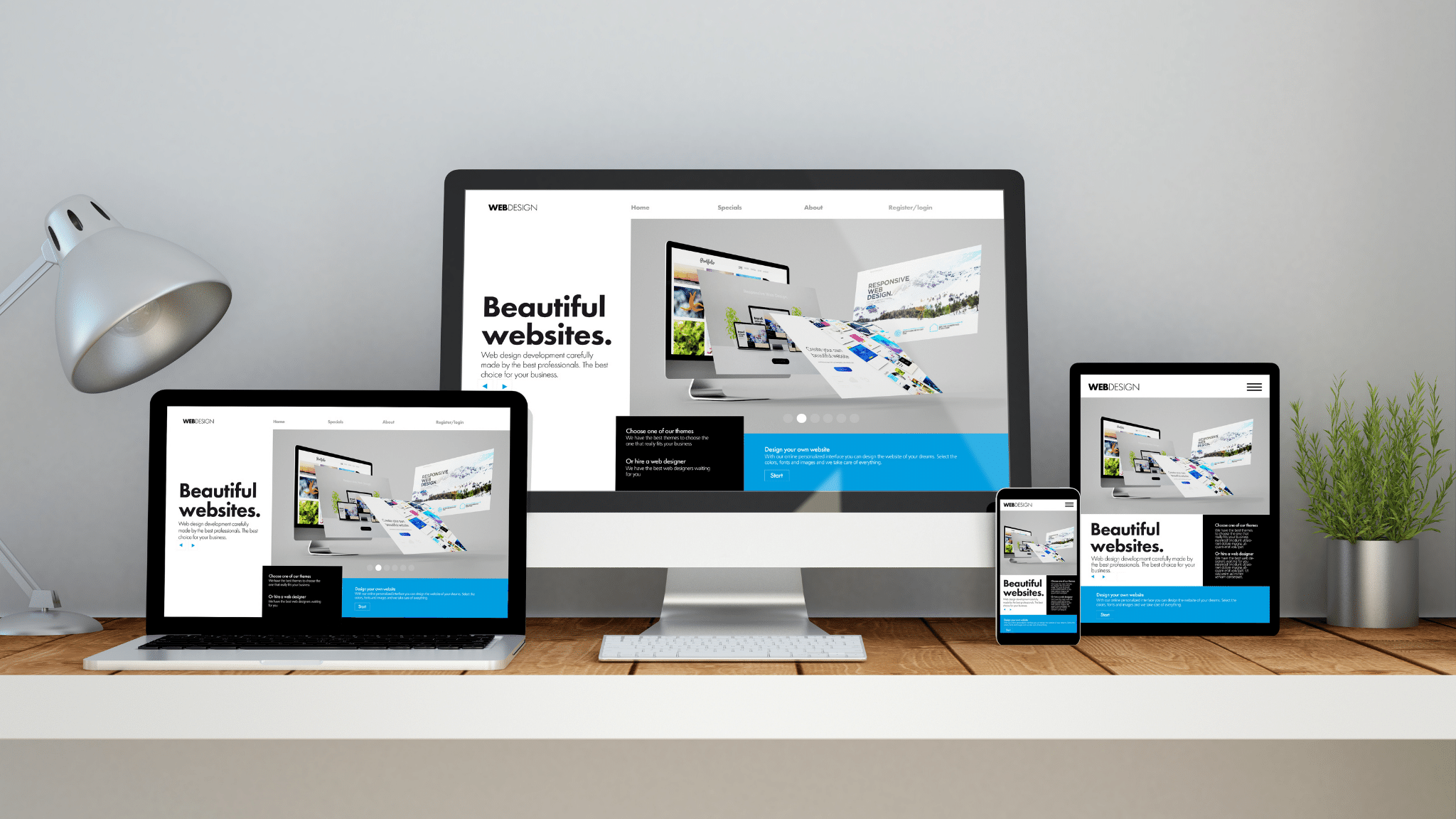
Having a mobile-responsive WordPress website means that your site is designed and optimized to provide an excellent viewing and interaction experience across various mobile devices, such as smartphones and tablets. Here’s a simple description of what mobile responsiveness entails:

1. **Flexible Layout**: A mobile-responsive WordPress website adjusts its layout and content dynamically based on the screen size and orientation of the device being used. Whether viewed on a small smartphone screen held vertically or a larger tablet screen held horizontally, the website adapts to ensure that content remains readable and accessible.

2. **Easy Navigation**: Mobile-responsive design prioritizes user-friendly navigation, making it effortless for visitors to find what they’re looking for on your website. Navigation menus may be condensed into collapsible or expandable formats, and buttons and links are sized appropriately for touch interaction.

3. **Readable Text and Images**: Text and images on a mobile-responsive WordPress site are optimized for readability on smaller screens. Fonts are scaled appropriately, and images are resized and compressed to ensure they load quickly without sacrificing quality. This ensures that visitors can easily consume content without the need for constant zooming or scrolling.

4. **Fast Loading Speed**: Mobile responsiveness often goes hand in hand with fast loading times. Optimizations such as image compression, minification of CSS and JavaScript files, and leveraging browser caching contribute to a smoother and quicker user experience on mobile devices.

5. **Optimized Forms**: Any forms present on your WordPress website, such as contact forms or signup forms, are designed to be easy to fill out on mobile devices. Form fields are appropriately spaced, and input fields are optimized for touch input, minimizing user frustration and increasing conversion rates.

6. **Cross-Browser Compatibility**: A mobile-responsive WordPress site is tested to ensure compatibility with various mobile browsers, including Safari, Chrome, Firefox, and others. This ensures a consistent experience regardless of the browser being used to access the site.

In essence, mobile responsiveness ensures that your WordPress website looks great and functions seamlessly across all devices, providing a positive user experience for visitors whether they’re browsing on a desktop computer, a smartphone, or a tablet. This adaptability is crucial in today’s digital landscape, where mobile usage continues to rise, and users expect websites to perform flawlessly on any device they choose.