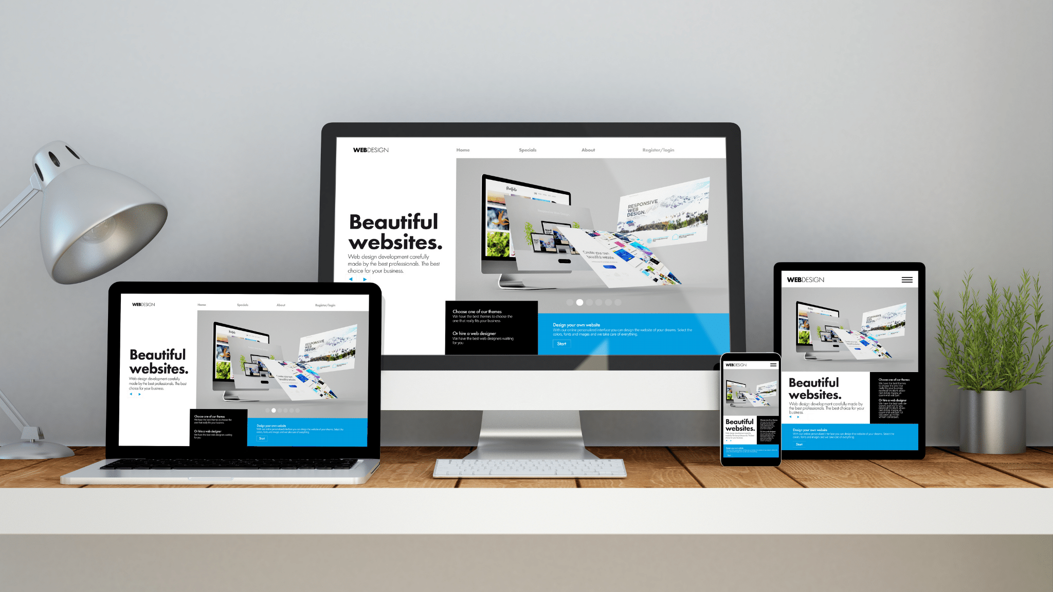
Having a mobile-responsive WordPress website means that your site is designed and optimized to provide an excellent viewing and interaction experience across various mobile devices, such as smartphones and tablets. Here’s a simple description of what mobile responsiveness entails:
1. **Flexible Layout**: A mobile-responsive WordPress website adjusts its layout and content dynamically based on the screen size and orientation of the device being used. Whether viewed on a small smartphone screen held vertically or a larger tablet screen held horizontally, the website adapts to ensure that content remains readable and accessible.
2. **Easy Navigation**: Mobile-responsive design prioritizes user-friendly navigation, making it effortless for visitors to find what they’re looking for on your website. Navigation menus may be condensed into collapsible or expandable formats, and buttons and links are sized appropriately for touch interaction.
3. **Readable Text and Images**: Text and images on a mobile-responsive WordPress site are optimized for readability on smaller screens. Fonts are scaled appropriately, and images are resized and compressed to ensure they load quickly without sacrificing quality. This ensures that visitors can easily consume content without the need for constant zooming or scrolling.
4. **Fast Loading Speed**: Mobile responsiveness often goes hand in hand with fast loading times. Optimizations such as image compression, minification of CSS and JavaScript files, and leveraging browser caching contribute to a smoother and quicker user experience on mobile devices.
5. **Optimized Forms**: Any forms present on your WordPress website, such as contact forms or signup forms, are designed to be easy to fill out on mobile devices. Form fields are appropriately spaced, and input fields are optimized for touch input, minimizing user frustration and increasing conversion rates.
6. **Cross-Browser Compatibility**: A mobile-responsive WordPress site is tested to ensure compatibility with various mobile browsers, including Safari, Chrome, Firefox, and others. This ensures a consistent experience regardless of the browser being used to access the site.
In essence, mobile responsiveness ensures that your WordPress website looks great and functions seamlessly across all devices, providing a positive user experience for visitors whether they’re browsing on a desktop computer, a smartphone, or a tablet. This adaptability is crucial in today’s digital landscape, where mobile usage continues to rise, and users expect websites to perform flawlessly on any device they choose.


Add a Comment